| Technology | Advantages | Disadvantages |
|---|---|---|
| EST sequencing Repetitively sequence clones from a cDNA library, reading from the 3' or 5' end. Collect identical sequences together, count how many of each are present. | Doesn't require sequences ahead of time | Very inefficient. The most frequent transcripts are sequenced over and over, while rare ones are missed. Normalization is possible, but then the sequences don't tell you about expression levels. Can't distinguish splice-variants with same 3' end. Only good for transcripts expressed above 1:1,000. |
| SAGE Serial analysis of gene expression. Get shorter tags from individual cDNA's, then paste together into a continuous sequence. | Same as ESTs | About 10x better than ESTs, since you can get about 10 tags per read. |
| Real-Time PCR This is the other RT-PCR, with the trade name TaqMan. Measure how many PCR cycles are required to amplify a transcript above threshold, then extrapolate back to get original copy number | Good for a small number of genes and many samples | Only useful for a small number of genes; gets expensive quickly. Relative expression levels good to +/-2x. |
| Differential display Originally, used restriction enzymes or primers to amplify internal regions of genes, then looked for differences in RFLP or AFLP patterns, then physically isolated and sequenced fragments. Current technologies (CuraGen's GeneCalling) use database look-up to identify gene by RE pair and fragment length. Peak height gives the transcript abundance. | Open system: don't need to know gene sequences before starting. Good to +/-1.5x and about 1:100,000. Multiple fragments per gene help distinguish homologs, splice variants. | If you don't know the gene sequences, you still have to sequence. |
| Microarrays and Chips Known DNA sequences are tethered to a solid support and a labeled experimental sample is allowed to hybridize. Position-dependent signal intensity indicates the expression level. | Systems can be home-built (CSHL runs workshops!) or purchased, or 3rd parties will do the work for you. Economies of scale for array production make this method better-suited for widely-studies genes/genomes. Good to +/-1.5x and about 1:100,000. | Can be expensive (especially commercial systems). Long-probe hybridization can confuse homologs. Requires knowledge of gene sequences before-hand. Sometimes are limited to measuring ratios (competitive hybridization) rather than direct levels. |
Since this first filter is experiment-specific, we won't spend much time on it.
The benefit of a data table, genes vs. samples, is that it insulates you from changes in the underlying experiments used to generate expression levels. We'll assume that you've generated a data table. If you've measured the expression level of a gene multiple times in a sample, we'll assume you've already taken the average.
cd ~
mkdir java
If you're using bash, then
export CLASSPATH="~/java"If you're using csh, try
setenv CLASSPATH "~/java"If you're not running a unix variant, switch!!! Then,
cd java
mkdir wombat
Now, download and save the FREE software!
Driver.java
Jama-1.0.1.zip
Save Driver.java as ~/java/wombat/
cd ~/java
unzip Jama-1.0.1.zip
cd ~/java/wombat
javac Driver.java
Then you should be able to execute the command
java wombat.Driverfrom any directory.
Warning!!! Wombat is untested, alpha-grade software. But it's free. All the examples I'll show were created with this software.
The raw data used to be available on-line from a public site, but
the link is now dead (shame! shame!). Here's a local copy of the raw data:
somogyi_raw.txt
As you can see, the format isn't exactly table-like. We'll accompany
Julia Child to the kitched and take the parsed data out of the oven:
somogyi.txt
Here's the perl parser I wrote to do
the conversion.
Now let's do some cleaning!
java wombat.Driver
Enter command: readDataFile somogyi.txt
  > readDataFile somogyi.txt
somogyi.txt: 112 rows, 9 cols
Enter command: writeData d0.html
  > writeData d0.html
Enter command: setBaseline 0.05
  > setBaseline 0.05
Enter command: normalizeColumn
  > normalizeColumn
Enter command: writeData d1.html
  > writeData d1.html
Enter command: getLogTransform
  > getLogTransform
Enter command: writeData d2.html
  > writeData d2.html
Enter command: subtractRowAverage
  > subtractRowAverage
Enter command: writeData d3.html
  > writeData d3.html
The data tables are written to html files. The color code is
| bright red | highest expression | |
| dull red | ||
| grey red | ||
| grey | average expression | |
| grey blue | ||
| dull blue | ||
| bright blue | lowest expression |
If you look at d0.html, you'll see that the raw data isn't very well normalized from sample to sample; the first 4 time points are particularly low. We fix this with the column normalization. Before row-averaging, d2.html, some genes are blue or red all the way across. This average behavior is subtracted in d3.html, and most genes change between blue and red somewhere across the time points.
Any of the operations we'll be using to analyze genes could just as well be used to analyze samples by taking the transpose of the data matrix. It depends on the questions you want to answer.
Suppose you're trying to figure out what a gene does. Then you might want to see which other genes are co-regulated. This means you'd want to cluster or classify genes (dependent variables) based on measurements in different samples (independent variables).
On the other hand, suppose you're trying to classify samples for disease diagnosis based on gene expression. Here the samples are the dependent variables and the genes are the independent variables.
In statistics texts, Dependent variables are usually called observations and are the rows. Independent variables are called variables and are the columns.
Here we'll keep the genes as the rows whether we're using them as dependent or independent variables.
Maybe you noticed that the two-step algorithm begs the question of how clusters are really defined. Here's a better description:
There are many methods to determine distances between genes. This is a standard problem in multivariate statistics. A good reference is Multivariate Analysis by Mardia, Kent, and Bibby.
The way I'll talk about is the standard correlation coefficient between
genes. Suppose you measure x(i) and y(i), the expression levels of genes
x and y, in samples i = 1, 2, 3, ..., N. The Pearson correlation coefficient
is
Correlation = S(x,y) / [S(x,x) S(y,y)]1/2
S(x,y) = [ sum of x(i)y(i) ] - [sum of x(i)][sum of y(i)]/N
and S(x,x) and S(y,y) are defined similarly.
The correlation is a number
between -1 (anti-correlated) and 1 (perfectly correlated). We expect a
correlation near 0 for genes chosen at random.
The benefit of using the correlation coefficient is that it looks at the
overall shape of a profile rather than the actual height. Genes that
are moving in the same direction are clustered together, which is what
we typically want. The correlation coefficient is converted
to a distance using the formula
Distance = Sqrt[2 - 2C]
and ranges from 0 to 2.
Three simple methods to determine the distance between clusters are
to use the smallest, average, or longest pairwise distance. These methods
actually overestimate the distance between clusters. In the language
of phylogeny, we want the distance between the ancestral sequences
for each cluster, not for the terminal taxa. Studier and Keppler's
neighbor-joining makes the appropriate correction and is the algorithm of
choice.
Historical footnote: Saitou and Nei were the first to propose an algorithm called neighbor joining (Mol Bio Evol 1987 4: 406). Most sources will tell you that the Studier-Keppler algorithm is just a faster form of the Saitou-Nei algorithm. This is not the case! Not only is the Saitou-Nei algorithm slower, it also fails to make the correction for the ancestral sequence difference. The results reported in Table II of Saitou-Nei are inconsistent with the correct (Studier-Keppler) formulation.
One major drawback of conventional phylogeny software is that you don't get to see your data table afterwards. I built a neighbor-joining algorithm into Wombat and here we give it a try, picking up where we left off.
Enter command: getRowDistance
  > getRowDistance
Enter command: getRowNJTree
  > getRowNJTree
Enter command: writeRowNJTree nj0.html
  > writeRowNJTree nj0.html
total lines: 223
lines written: 223
Neighbor-joining runs until every gene is clustered, which means that N genes lead to a tree with N+(N-1) nodes. As a result, genes with very similar patterns must eventually be split into different clusters. This is not a good situation! Many ad hoc approaches to collapsing the clusters have been suggested, often requiring trial-and-error on the part of a user.
I've implemented an automatic solution that even has a solid statistical basis. I calculate the p-value for each interior branch. If the p-value is below a critical threshold, I keep the branch; otherwise, I get rid of the branch and collect the children into a single group.
Enter command: collapseRowNJTree 0.055
  > collapseRowNJTree 0.055
Enter command: writeRowNJTree nj1.html
  > writeRowNJTree nj1.html
total lines: 128
lines written: 128
Now it's easy to see clusters. The number after the name of each gene (or internal node) is the p-value for the split. P-values of 0.05 are typically thresholds used for determining statistical significance. In other words, it's only 5% likely that genes chosen at random would be as highly correlated as genes in the same cluster.
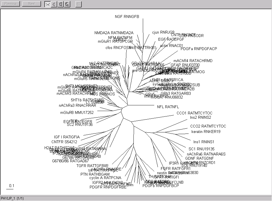
Here are the gene and sample clusters viewed with Rod Page's treeview. Here are the trees I got for the genes and the samples using Phylip earlier.
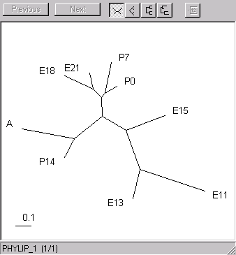
| The samples. The early embryonic (11-15 days) branch off, as do the latest stages (14 days postnatal and adult). The late embryonic and early post-natal form a third cluster. | |
| The genes | |
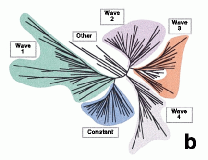
| For comparison, here are the genes as clustered in Somogyi's paper using a similar method. |
|
Why is this important?
The method we'll use, again standard in multivariate statistics, is principal factor analysis. It's a standard tool when you're making many observations, here on multiple genes or samples, that depend on a smaller number of underlying factors.
In our example, the 9 samples might be explained by a smaller number of factors, for example a trend of increasing expression and a trend of decreasing expression. Another way of looking at this is to ask how much more information we'd have (or how much we'd lose) if we changed the number of samples we measured.
In principal factor analysis, we look at linear combinations of the samples
that explain most of the variation in the data. For example, we see
that some genes increase their levels from left to right. A linear
combination
-4 -3 -2 -1 0 1 2 3 4
taking -4 times the expression level at time 1, -3 times the level at time
2, ..., and 4 times the level at time 9 would match this pattern.
What we do to find the patterns is look at the eigenvalues and eigenvectors of the covariance matrix between samples. (Sometimes the correlation matrix is used instead, particularly when measurements in different units are compared.) The eigenvectors are the patterns, and the eigenvalues tell you how important each pattern is. Techniques called principal component analysis and singular value decomposition are essentially equivalent. People even make up names, like shredding, for this approach. Here is how to do it with Wombat:
Enter command: getColumnFactors cov
  > getColumnFactors cov
0 0.60815945630083146
1 0.16345106435544968
2 0.07725477299175236
3 0.03367434681634587
4 0.02740019216720446
5 0.01414308625815127
6 0.01016387551998999
7 0.00347897132086952
8 2.9868497061411547E-17

  0.603 -0.360  0.316 -0.450  0.300 -0.030  0.013 -0.028  0.333
  0.533 -0.087 -0.201  0.574 -0.454  0.125 -0.036  0.051  0.333
  0.147  0.492 -0.569 -0.048  0.411 -0.330  0.140 -0.005  0.333
 -0.069  0.423  0.062 -0.263 -0.115  0.453 -0.634 -0.093  0.333
 -0.138  0.292  0.305 -0.154 -0.252  0.099  0.510  0.576  0.333
 -0.169  0.137  0.322  0.060 -0.221 -0.253  0.260 -0.742  0.333
 -0.261 -0.119  0.329  0.387  0.244 -0.466 -0.426  0.298  0.333
 -0.308 -0.288 -0.104  0.272  0.459  0.585  0.244 -0.108  0.333
 -0.337 -0.488 -0.462 -0.379 -0.370 -0.183 -0.073  0.051  0.333

Using first 9 factors
      PFA       E11       E13       E15       E18       E21        P0        P7       P14         A
    Fac 1  4.71e-01  4.16e-01  1.15e-01 -5.44e-02 -1.08e-01 -1.32e-01 -2.04e-01 -2.40e-01 -2.63e-01
    Fac 2 -1.46e-01 -3.55e-02  1.99e-01  1.71e-01  1.18e-01  5.56e-02 -4.84e-02 -1.17e-01 -1.97e-01
    Fac 3  8.79e-02 -5.59e-02 -1.58e-01  1.75e-02  8.50e-02  8.98e-02  9.16e-02 -2.90e-02 -1.29e-01
    Fac 4 -8.26e-02  1.05e-01 -8.86e-03 -4.84e-02 -2.83e-02  1.12e-02  7.10e-02  5.00e-02 -6.96e-02
    Fac 5  4.97e-02 -7.52e-02  6.80e-02 -1.91e-02 -4.18e-02 -3.67e-02  4.04e-02  7.61e-02 -6.14e-02
    Fac 6 -3.68e-03  1.49e-02 -3.93e-02  5.40e-02  1.18e-02 -3.02e-02 -5.54e-02  6.97e-02 -2.18e-02
    Fac 7  1.39e-03 -3.65e-03  1.42e-02 -6.40e-02  5.15e-02  2.63e-02 -4.30e-02  2.46e-02 -7.39e-03
    Fac 8 -1.68e-03  3.04e-03 -3.00e-04 -5.54e-03  3.40e-02 -4.38e-02  1.76e-02 -6.38e-03  3.04e-03
    Fac 9  1.82e-09  1.82e-09  1.82e-09  1.82e-09  1.82e-09  1.82e-09  1.82e-09  1.82e-09  1.82e-09
Enter command:
The first set of numbers shows how important each pattern is in describing the data. The
first pattern, number 0, explains 61 percent of the variation, the second pattern explains 16%, and
the importance decreases raplidly thereafter. We'll ignore the other two sets of numbers and look
and the graphical representation instead:
Enter command: writeData d4.html
  > writeData d4.html
The patterns are displayed at the top of the page, above the data. The first pattern is high expression, then decreasing. The second pattern is highest in the middle. The colors become less intense as the patterns become less important. These numbers are usually called the factor loadings.
To the right of the main table are the factor scores, indicating how much each pattern contributes to each gene. As you can see, the contributions become dimmer and less important from left to right.
We can put this view together with the tree view to see how well the patterns describe the data.
Enter command: writeRowNJTree nj2.html
  > writeRowNJTree nj2.html
total lines: 128
lines written: 128
We see that, in most clusters, the first two factors usually keep the same colors, while the other factors change color. This means that the other factors aren't significant enough to distinguish between genes. We also see that we might have been too strict in calling branches insignificant. For example, in the cluster starting with 5HT_MOUSE5HT3, there's a red-red group and a red-blue group. In fact, we might do a better job of clustering if we use the factor scores rather than raw data.
Here are the patterns cut out from the file:
| PFA | E11 | E13 | E15 | E18 | E21 | P0 | P7 | P14 | A |
|---|---|---|---|---|---|---|---|---|---|
| Fac 1 | 0.47 | 0.42 | 0.12 | -0.05 | -0.11 | -0.13 | -0.20 | -0.24 | -0.26 |
| Fac 2 | -0.15 | -0.04 | 0.20 | 0.17 | 0.12 | 0.06 | -0.05 | -0.12 | -0.20 |
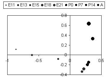
We can plot the samples in x-y coordinates using the factor scores, and the results are interesting.
| In this figure the biological states (embryonic days, post-natal days, and adult) are plotted according to the first and second principal factors. The first factor apparantly describes changes during embryonic development culminating at E18, and the second factor describes changes from E18 to Adult. Now we see why E18, E21, P0, and P7 were grouped together in the clustering. |
|
Somogyi's paper illustrates these patterns as temporal waves of gene expression.
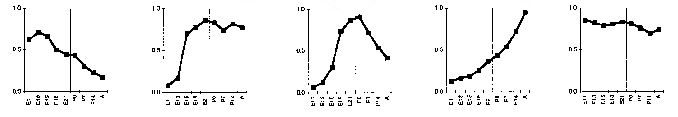
The first and fourth waves are both described by our first pattern. The third wave is like our
second pattern.
Enter command: sortRowNJTree 1.2.3.4.5.6.7.8.9
  > sortRowNJTree 1.2.3.4.5.6.7.8.9
final corln: -0.45569793624619581
Enter command: writeRowNJTree nj3.html
  > writeRowNJTree nj3.html
total lines: 128
lines written: 128
The pattern 1.2.3.4.5.6.7.8.9 is used to drive the sorting. Genes with increasing expression levels are sorted to the top, and genes with decreasing levels are sorted to the bottom.
Similarly, we can sort the tree to bring genes expressed highest at the middle timepoint to the top of the list.
Enter command: sortRowNJTree 1.2.3.4.5.4.3.2.1
  > sortRowNJTree 1.2.3.4.5.4.3.2.1
Enter command: writeRowNJTree nj4.html
  > writeRowNJTree nj4.html
total lines: 128
lines written: 128
You could use this method for prediction. For example, you measure the expression level of a gene over several samples. You then can use its profile to sort a list of other genes. Or, using the matrix transpose, you could classify a sample by its gene expression profile.
In talking about clustering, I've only covered hierarchical methods. Other approaches include self-organizing maps, neural nets, and classification and regression trees, all with substantial bodies of literature.
Standard statistics packages, like SAS and S-plus, do everything you need, but you have to know what to do. (Of course, after this tutorial, you're an expert!) Other packages like Partek are aimed at visualization and data mining.
Packages aimed for the gene expression market in particular are offered by Spotfire and Silicon Genetics. Mike Eisen has a nice package licensed by Stanford.
If you have any questions, feel free to email or call me. Happy hunting!